 |
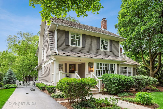
| 739 S. Lincoln, Hinsdale. Photo from Realtor site. |
 |
| The Sears Amhurst from the 1926 Modern Homes catalog. |
Sears sold the Amhurst from 1926 to 1928. Only a handful have been located nationwide, and there are two authenticated Amhursts in the Chicago area--this one in Hinsdale and another in Glen Ellyn.
See how the center window on the side doesn't go down to the trim level as shown on the illustration? That is the case on every known Amhurst. Sometimes Sears got the catalog illustrations wrong.
 |
| Another angle. Photo from Realtor site. |
One of the stylistic selling points of the Amhurst was that the second story was wood siding and the first story was brick veneer. Sears said the house had "picturesque and distinctive beauty". Our Amhurst in Hinsdale has had the brick veneer removed so that both stories match.
 |
| That is a modern "Craftsman" newel post. Photo from Realtor site. |
 |
| Photo from Realtor site. |
 |
| Photo from Realtor site. |
 |
| Photo from Realtor site. |
 |
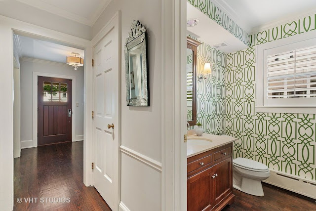
| There wasn't a half bath on the original floor plan. Photo from Realtor site. |
 |
| Photo from Realtor site. |
 |
| There wasn't an open concept kitchen and family room on the original floor plan. Photo from Realtor site. |
 |
| Photo from Realtor site. |
The Amhurst was purchased by Alfonso G. Mesenbrink for $8,000 in February 1928. Alfonso got his financing from Sears Roebuck. He was a carpenter, and built the house for his family.
The Amhurst last sold for $1.24M.

4 comments:
Alterations to the exteriors of kit house typically bother me, but I kind of like the all-wood cladding on this Amhurst. In addition to dispensing with the brick veneer, it appears that the house was given overhanging eaves -- the catalog illustration shows the house with cropped eaves. Much better than the usual horrific modifications. There doesn't appear to be much left of the original interior.
Yes that's true. The other Amhursts have the eaves just as shown in the illustration.
Seems like those changes from the catalog illustration were likely made at original construction? The windows appear original, which is usually one of the first major items to get remuddled these days.
The changes appear to be fairly recent. The mullions between the triple windows are much narrower than what was typical of the 1920's (and narrower than those seen in the catalog). Also, the catalog illustration shows a wider center window flanked by slightly narrower windows. The three windows today are all the same size, and perfectly match the new triple window of the addition. The alterations, including the eaves, were done well enough that they don't jump out as modifications!
Post a Comment